The Button widget is used to add buttons in a Python application. These buttons can display text or images that convey the purpose of the buttons. You can attach a function or a method to a button which is called automatically when you click the button.
Here is the simple syntax to create this widget −
w = Button ( master, option=value, ... )
master − This represents the parent window.
options − Here is the list of most commonly used options for this widget. These options can be used as key-value pairs separated by commas.
| Sr.No. | Option & Description |
|---|---|
| 1 | activebackground Background color when the button is under the cursor. |
| 2 | activeforeground Foreground color when the button is under the cursor. |
| 3 | bd Border width in pixels. Default is 2. |
| 4 | bg Normal background color. |
| 5 | command Function or method to be called when the button is clicked. |
| 6 | fg Normal foreground (text) color. |
| 7 | font Text font to be used for the button's label. |
| 8 | height Height of the button in text lines (for textual buttons) or pixels (for images). |
| 9 | highlightcolor The color of the focus highlight when the widget has focus. |
| 10 | image Image to be displayed on the button (instead of text). |
| 11 | justify How to show multiple text lines: LEFT to left-justify each line; CENTER to center them; or RIGHT to right-justify. |
| 12 | padx Additional padding left and right of the text. |
| 13 | pady Additional padding above and below the text. |
| 14 | relief Relief specifies the type of the border. Some of the values are SUNKEN, RAISED, GROOVE, and RIDGE. |
| 15 | state Set this option to DISABLED to gray out the button and make it unresponsive. Has the value ACTIVE when the mouse is over it. Default is NORMAL. |
| 16 | underline Default is -1, meaning that no character of the text on the button will be underlined. If nonnegative, the corresponding text character will be underlined. |
| 17 | width Width of the button in letters (if displaying text) or pixels (if displaying an image). |
| 18 | wraplength If this value is set to a positive number, the text lines will be wrapped to fit within this length. |
Following are commonly used methods for this widget −
| Sr.No. | Method & Description |
|---|---|
| 1 | flash() Causes the button to flash several times between active and normal colors. Leaves the button in the state it was in originally. Ignored if the button is disabled. |
| 2 | invoke() Calls the button's callback, and returns what that function returns. Has no effect if the button is disabled or there is no callback. |
Try the following example yourself −
import Tkinter
import tkMessageBox

top = Tkinter.Tk()

def helloCallBack():
   tkMessageBox.showinfo( "Hello Python", "Hello World")

B = Tkinter.Button(top, text ="Hello", command = helloCallBack)

B.pack()
top.mainloop()
When the above code is executed, it produces the following result −
The Canvas is a rectangular area intended for drawing pictures or other complex layouts. You can place graphics, text, widgets or frames on a Canvas.
Here is the simple syntax to create this widget −
w = Canvas ( master, option=value, ... )
master − This represents the parent window.
options − Here is the list of most commonly used options for this widget. These options can be used as key-value pairs separated by commas.
| Sr.No. | Option & Description |
|---|---|
| 1 | bd Border width in pixels. Default is 2. |
| 2 | bg Normal background color. |
| 3 | confine If true (the default), the canvas cannot be scrolled outside of the scrollregion. |
| 4 | cursor Cursor used in the canvas like arrow, circle, dot etc. |
| 5 | height Size of the canvas in the Y dimension. |
| 6 | highlightcolor Color shown in the focus highlight. |
| 7 | relief Relief specifies the type of the border. Some of the values are SUNKEN, RAISED, GROOVE, and RIDGE. |
| 8 | scrollregion A tuple (w, n, e, s) that defines over how large an area the canvas can be scrolled, where w is the left side, n the top, e the right side, and s the bottom. |
| 9 | width Size of the canvas in the X dimension. |
| 10 | xscrollincrement If you set this option to some positive dimension, the canvas can be positioned only on multiples of that distance, and the value will be used for scrolling by scrolling units, such as when the user clicks on the arrows at the ends of a scrollbar. |
| 11 | xscrollcommand If the canvas is scrollable, this attribute should be the .set() method of the horizontal scrollbar. |
| 12 | yscrollincrement Works like xscrollincrement, but governs vertical movement. |
| 13 | yscrollcommand If the canvas is scrollable, this attribute should be the .set() method of the vertical scrollbar. |
The Canvas widget can support the following standard items −
arc − Creates an arc item, which can be a chord, a pieslice or a simple arc.
coord = 10, 50, 240, 210
arc = canvas.create_arc(coord, start=0, extent=150, fill="blue")
image − Creates an image item, which can be an instance of either the BitmapImage or the PhotoImage classes.
filename = PhotoImage(file = "sunshine.gif")
image = canvas.create_image(50, 50, anchor=NE, image=filename)
line − Creates a line item.
line = canvas.create_line(x0, y0, x1, y1, ..., xn, yn, options)
oval − Creates a circle or an ellipse at the given coordinates. It takes two pairs of coordinates; the top left and bottom right corners of the bounding rectangle for the oval.
oval = canvas.create_oval(x0, y0, x1, y1, options)
polygon − Creates a polygon item that must have at least three vertices.
oval = canvas.create_polygon(x0, y0, x1, y1,...xn, yn, options)
Try the following example yourself −
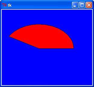
import Tkinter

top = Tkinter.Tk()

C = Tkinter.Canvas(top, bg="blue", height=250, width=300)

coord = 10, 50, 240, 210
arc = C.create_arc(coord, start=0, extent=150, fill="red")

C.pack()
top.mainloop()
When the above code is executed, it produces the following result −
The Checkbutton widget is used to display a number of options to a user as toggle buttons. The user can then select one or more options by clicking the button corresponding to each option.
You can also display images in place of text.
Here is the simple syntax to create this widget −
w = Checkbutton ( master, option, ... )
master − This represents the parent window.
options − Here is the list of most commonly used options for this widget. These options can be used as key-value pairs separated by commas.
| Sr.No. | Option & Description |
|---|---|
| 1 | activebackground Background color when the checkbutton is under the cursor. |
| 2 | activeforeground Foreground color when the checkbutton is under the cursor. |
| 3 | bg The normal background color displayed behind the label and indicator. |
| 4 | bitmap To display a monochrome image on a button. |
| 5 | bd The size of the border around the indicator. Default is 2 pixels. |
| 6 | command A procedure to be called every time the user changes the state of this checkbutton. |
| 7 | cursor If you set this option to a cursor name (arrow, dot etc.), the mouse cursor will change to that pattern when it is over the checkbutton. |
| 8 | disabledforeground The foreground color used to render the text of a disabled checkbutton. The default is a stippled version of the default foreground color. |
| 9 | font The font used for the text. |
| 10 | fg The color used to render the text. |
| 11 | height The number of lines of text on the checkbutton. Default is 1. |
| 12 | highlightcolor The color of the focus highlight when the checkbutton has the focus. |
| 13 | image To display a graphic image on the button. |
| 14 | justify If the text contains multiple lines, this option controls how the text is justified: CENTER, LEFT, or RIGHT. |
| 15 | offvalue Normally, a checkbutton's associated control variable will be set to 0 when it is cleared (off). You can supply an alternate value for the off state by setting offvalue to that value. |
| 16 | onvalue Normally, a checkbutton's associated control variable will be set to 1 when it is set (on). You can supply an alternate value for the on state by setting onvalue to that value. |
| 17 | padx How much space to leave to the left and right of the checkbutton and text. Default is 1 pixel. |
| 18 | pady How much space to leave above and below the checkbutton and text. Default is 1 pixel. |
| 19 | relief With the default value, relief=FLAT, the checkbutton does not stand out from its background. You may set this option to any of the other styles |
| 20 | selectcolor The color of the checkbutton when it is set. Default is selectcolor="red". |
| 21 | selectimage If you set this option to an image, that image will appear in the checkbutton when it is set. |
| 22 | state The default is state=NORMAL, but you can use state=DISABLED to gray out the control and make it unresponsive. If the cursor is currently over the checkbutton, the state is ACTIVE. |
| 23 | text The label displayed next to the checkbutton. Use newlines ("\n") to display multiple lines of text. |
| 24 | underline With the default value of -1, none of the characters of the text label are underlined. Set this option to the index of a character in the text (counting from zero) to underline that character. |
| 25 | variable The control variable that tracks the current state of the checkbutton. Normally this variable is an IntVar, and 0 means cleared and 1 means set, but see the offvalue and onvalue options above. |
| 26 | width The default width of a checkbutton is determined by the size of the displayed image or text. You can set this option to a number of characters and the checkbutton will always have room for that many characters. |
| 27 | wraplength Normally, lines are not wrapped. You can set this option to a number of characters and all lines will be broken into pieces no longer than that number. |
Following are commonly used methods for this widget −
| Sr.No. | Method & Description |
|---|---|
| 1 | deselect() Clears (turns off) the checkbutton. |
| 2 | flash() Flashes the checkbutton a few times between its active and normal colors, but leaves it the way it started. |
| 3 | invoke() You can call this method to get the same actions that would occur if the user clicked on the checkbutton to change its state. |
| 4 | select() Sets (turns on) the checkbutton. |
| 5 | toggle() Clears the checkbutton if set, sets it if cleared. |
Try the following example yourself −
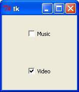
from Tkinter import *
import tkMessageBox
import Tkinter

top = Tkinter.Tk()
CheckVar1 = IntVar()
CheckVar2 = IntVar()
C1 = Checkbutton(top, text = "Music", variable = CheckVar1, \
                 onvalue = 1, offvalue = 0, height=5, \
                 width = 20)
C2 = Checkbutton(top, text = "Video", variable = CheckVar2, \
                 onvalue = 1, offvalue = 0, height=5, \
                 width = 20)
C1.pack()
C2.pack()
top.mainloop()
When the above code is executed, it produces the following result −
The Entry widget is used to accept single-line text strings from a user.
If you want to display multiple lines of text that can be edited, then you should use the Text widget.
If you want to display one or more lines of text that cannot be modified by the user, then you should use the Label widget.
Here is the simple syntax to create this widget −
w = Entry( master, option, ... )
master − This represents the parent window.
options − Here is the list of most commonly used options for this widget. These options can be used as key-value pairs separated by commas.
| Sr.No. | Option & Description |
|---|---|
| 1 | bg The normal background color displayed behind the label and indicator. |
| 2 | bd The size of the border around the indicator. Default is 2 pixels. |
| 3 | command A procedure to be called every time the user changes the state of this checkbutton. |
| 4 | cursor If you set this option to a cursor name (arrow, dot etc.), the mouse cursor will change to that pattern when it is over the checkbutton. |
| 5 | font The font used for the text. |
| 6 | exportselection By default, if you select text within an Entry widget, it is automatically exported to the clipboard. To avoid this exportation, use exportselection=0. |
| 7 | fg The color used to render the text. |
| 8 | highlightcolor The color of the focus highlight when the checkbutton has the focus. |
| 9 | justify If the text contains multiple lines, this option controls how the text is justified: CENTER, LEFT, or RIGHT. |
| 10 | relief With the default value, relief=FLAT, the checkbutton does not stand out from its background. You may set this option to any of the other styles |
| 11 | selectbackground The background color to use displaying selected text. |
| 12 | selectborderwidth The width of the border to use around selected text. The default is one pixel. |
| 13 | selectforeground The foreground (text) color of selected text. |
| 14 | show Normally, the characters that the user types appear in the entry. To make a .password. entry that echoes each character as an asterisk, set show="*". |
| 15 | state The default is state=NORMAL, but you can use state=DISABLED to gray out the control and make it unresponsive. If the cursor is currently over the checkbutton, the state is ACTIVE. |
| 16 | textvariable In order to be able to retrieve the current text from your entry widget, you must set this option to an instance of the StringVar class. |
| 17 | width The default width of a checkbutton is determined by the size of the displayed image or text. You can set this option to a number of characters and the checkbutton will always have room for that many characters. |
| 18 | xscrollcommand If you expect that users will often enter more text than the onscreen size of the widget, you can link your entry widget to a scrollbar. |
Following are commonly used methods for this widget −
| Sr.No. | Method & Description |
|---|---|
| 1 | delete ( first, last=None ) Deletes characters from the widget, starting with the one at index first, up to but not including the character at position last. If the second argument is omitted, only the single character at position first is deleted. |
| 2 | get() Returns the entry's current text as a string. |
| 3 | icursor ( index ) Set the insertion cursor just before the character at the given index. |
| 4 | index ( index ) Shift the contents of the entry so that the character at the given index is the leftmost visible character. Has no effect if the text fits entirely within the entry. |
| 5 | insert ( index, s ) Inserts string s before the character at the given index. |
| 6 | select_adjust ( index ) This method is used to make sure that the selection includes the character at the specified index. |
| 7 | select_clear() Clears the selection. If there isn't currently a selection, has no effect. |
| 8 | select_from ( index ) Sets the ANCHOR index position to the character selected by index, and selects that character. |
| 9 | select_present() If there is a selection, returns true, else returns false. |
| 10 | select_range ( start, end ) Sets the selection under program control. Selects the text starting at the start index, up to but not including the character at the end index. The start position must be before the end position. |
| 11 | select_to ( index ) Selects all the text from the ANCHOR position up to but not including the character at the given index. |
| 12 | xview ( index ) This method is useful in linking the Entry widget to a horizontal scrollbar. |
| 13 | xview_scroll ( number, what ) Used to scroll the entry horizontally. The what argument must be either UNITS, to scroll by character widths, or PAGES, to scroll by chunks the size of the entry widget. The number is positive to scroll left to right, negative to scroll right to left. |
Try the following example yourself −
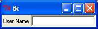
from Tkinter import *

top = Tk()
L1 = Label(top, text="User Name")
L1.pack( side = LEFT)
E1 = Entry(top, bd =5)
E1.pack(side = RIGHT)

top.mainloop()
When the above code is executed, it produces the following result −
The Frame widget is very important for the process of grouping and organizing other widgets in a somehow friendly way. It works like a container, which is responsible for arranging the position of other widgets.
It uses rectangular areas in the screen to organize the layout and to provide padding of these widgets. A frame can also be used as a foundation class to implement complex widgets.
Here is the simple syntax to create this widget −
w = Frame ( master, option, ... )
master − This represents the parent window.
options − Here is the list of most commonly used options for this widget. These options can be used as key-value pairs separated by commas.
| Sr.No. | Option & Description |
|---|---|
| 1 | bg The normal background color displayed behind the label and indicator. |
| 2 | bd The size of the border around the indicator. Default is 2 pixels. |
| 3 | cursor If you set this option to a cursor name (arrow, dot etc.), the mouse cursor will change to that pattern when it is over the checkbutton. |
| 4 | height The vertical dimension of the new frame. |
| 5 | highlightbackground Color of the focus highlight when the frame does not have focus. |
| 6 | highlightcolor Color shown in the focus highlight when the frame has the focus. |
| 7 | highlightthickness Thickness of the focus highlight. |
| 8 | relief With the default value, relief=FLAT, the checkbutton does not stand out from its background. You may set this option to any of the other styles |
| 9 | width The default width of a checkbutton is determined by the size of the displayed image or text. You can set this option to a number of characters and the checkbutton will always have room for that many characters. |
Try the following example yourself −
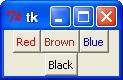
from Tkinter import *

root = Tk()
frame = Frame(root)
frame.pack()

bottomframe = Frame(root)
bottomframe.pack( side = BOTTOM )

redbutton = Button(frame, text="Red", fg="red")
redbutton.pack( side = LEFT)

greenbutton = Button(frame, text="Brown", fg="brown")
greenbutton.pack( side = LEFT )

bluebutton = Button(frame, text="Blue", fg="blue")
bluebutton.pack( side = LEFT )

blackbutton = Button(bottomframe, text="Black", fg="black")
blackbutton.pack( side = BOTTOM)

root.mainloop()
When the above code is executed, it produces the following result −
This widget implements a display box where you can place text or images. The text displayed by this widget can be updated at any time you want.
It is also possible to underline part of the text (like to identify a keyboard shortcut) and span the text across multiple lines.
Here is the simple syntax to create this widget −
w = Label ( master, option, ... )
master − This represents the parent window.
options − Here is the list of most commonly used options for this widget. These options can be used as key-value pairs separated by commas.
| Sr.No. | Option & Description |
|---|---|
| 1 | anchor This options controls where the text is positioned if the widget has more space than the text needs. The default is anchor=CENTER, which centers the text in the available space. |
| 2 | bg The normal background color displayed behind the label and indicator. |
| 3 | bitmap Set this option equal to a bitmap or image object and the label will display that graphic. |
| 4 | bd The size of the border around the indicator. Default is 2 pixels. |
| 5 | cursor If you set this option to a cursor name (arrow, dot etc.), the mouse cursor will change to that pattern when it is over the checkbutton. |
| 6 | font If you are displaying text in this label (with the text or textvariable option, the font option specifies in what font that text will be displayed. |
| 7 | fg If you are displaying text or a bitmap in this label, this option specifies the color of the text. If you are displaying a bitmap, this is the color that will appear at the position of the 1-bits in the bitmap. |
| 8 | height The vertical dimension of the new frame. |
| 9 | image To display a static image in the label widget, set this option to an image object. |
| 10 | justify Specifies how multiple lines of text will be aligned with respect to each other: LEFT for flush left, CENTER for centered (the default), or RIGHT for right-justified. |
| 11 | padx Extra space added to the left and right of the text within the widget. Default is 1. |
| 12 | pady Extra space added above and below the text within the widget. Default is 1. |
| 13 | relief Specifies the appearance of a decorative border around the label. The default is FLAT; for other values. |
| 14 | text To display one or more lines of text in a label widget, set this option to a string containing the text. Internal newlines ("\n") will force a line break. |
| 15 | textvariable To slave the text displayed in a label widget to a control variable of class StringVar, set this option to that variable. |
| 16 | underline You can display an underline (_) below the nth letter of the text, counting from 0, by setting this option to n. The default is underline=-1, which means no underlining. |
| 17 | width Width of the label in characters (not pixels!). If this option is not set, the label will be sized to fit its contents. |
| 18 | wraplength You can limit the number of characters in each line by setting this option to the desired number. The default value, 0, means that lines will be broken only at newlines. |
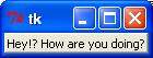
Try the following example yourself −
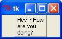
from Tkinter import *

root = Tk()
var = StringVar()
label = Label( root, textvariable=var, relief=RAISED )

var.set("Hey!? How are you doing?")
label.pack()
root.mainloop()
When the above code is executed, it produces the following result −
The Listbox widget is used to display a list of items from which a user can select a number of items.
Here is the simple syntax to create this widget −
w = Listbox ( master, option, ... )
master − This represents the parent window.
options − Here is the list of most commonly used options for this widget. These options can be used as key-value pairs separated by commas.
| Sr.No. | Option & Description |
|---|---|
| 1 | bg The normal background color displayed behind the label and indicator. |
| 2 | bd The size of the border around the indicator. Default is 2 pixels. |
| 3 | cursor The cursor that appears when the mouse is over the listbox. |
| 4 | font The font used for the text in the listbox. |
| 5 | fg The color used for the text in the listbox. |
| 6 | height Number of lines (not pixels!) shown in the listbox. Default is 10. |
| 7 | highlightcolor Color shown in the focus highlight when the widget has the focus. |
| 8 | highlightthickness Thickness of the focus highlight. |
| 9 | relief Selects three-dimensional border shading effects. The default is SUNKEN. |
| 10 | selectbackground The background color to use displaying selected text. |
| 11 | selectmode Determines how many items can be selected, and how mouse drags affect the selection −
|
| 12 | width The width of the widget in characters. The default is 20. |
| 13 | xscrollcommand If you want to allow the user to scroll the listbox horizontally, you can link your listbox widget to a horizontal scrollbar. |
| 14 | yscrollcommand If you want to allow the user to scroll the listbox vertically, you can link your listbox widget to a vertical scrollbar. |
Methods on listbox objects include −
| Sr.No. | Option & Description |
|---|---|
| 1 | activate ( index ) Selects the line specifies by the given index. |
| 2 | curselection() Returns a tuple containing the line numbers of the selected element or elements, counting from 0. If nothing is selected, returns an empty tuple. |
| 3 | delete ( first, last=None ) Deletes the lines whose indices are in the range [first, last]. If the second argument is omitted, the single line with index first is deleted. |
| 4 | get ( first, last=None ) Returns a tuple containing the text of the lines with indices from first to last, inclusive. If the second argument is omitted, returns the text of the line closest to first. |
| 5 | index ( i ) If possible, positions the visible part of the listbox so that the line containing index i is at the top of the widget. |
| 6 | insert ( index, *elements ) Insert one or more new lines into the listbox before the line specified by index. Use END as the first argument if you want to add new lines to the end of the listbox. |
| 7 | nearest ( y ) Return the index of the visible line closest to the y-coordinate y relative to the listbox widget. |
| 8 | see ( index ) Adjust the position of the listbox so that the line referred to by index is visible. |
| 9 | size() Returns the number of lines in the listbox. |
| 10 | xview() To make the listbox horizontally scrollable, set the command option of the associated horizontal scrollbar to this method. |
| 11 | xview_moveto ( fraction ) Scroll the listbox so that the leftmost fraction of the width of its longest line is outside the left side of the listbox. Fraction is in the range [0,1]. |
| 12 | xview_scroll ( number, what ) Scrolls the listbox horizontally. For the what argument, use either UNITS to scroll by characters, or PAGES to scroll by pages, that is, by the width of the listbox. The number argument tells how many to scroll. |
| 13 | yview() To make the listbox vertically scrollable, set the command option of the associated vertical scrollbar to this method. |
| 14 | yview_moveto ( fraction ) Scroll the listbox so that the top fraction of the width of its longest line is outside the left side of the listbox. Fraction is in the range [0,1]. |
| 15 | yview_scroll ( number, what ) Scrolls the listbox vertically. For the what argument, use either UNITS to scroll by lines, or PAGES to scroll by pages, that is, by the height of the listbox. The number argument tells how many to scroll. |
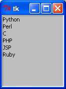
Try the following example yourself −
from Tkinter import *
import tkMessageBox
import Tkinter

top = Tk()

Lb1 = Listbox(top)
Lb1.insert(1, "Python")
Lb1.insert(2, "Perl")
Lb1.insert(3, "C")
Lb1.insert(4, "PHP")
Lb1.insert(5, "JSP")
Lb1.insert(6, "Ruby")

Lb1.pack()
top.mainloop()
When the above code is executed, it produces the following result −
A menubutton is the part of a drop-down menu that stays on the screen all the time. Every menubutton is associated with a Menu widget that can display the choices for that menubutton when the user clicks on it.
Here is the simple syntax to create this widget −
w = Menubutton ( master, option, ... )
master − This represents the parent window.
options − Here is the list of most commonly used options for this widget. These options can be used as key-value pairs separated by commas.
| Sr.No. | Option & Description |
|---|---|
| 1 | activebackground The background color when the mouse is over the menubutton. |
| 2 | activeforeground The foreground color when the mouse is over the menubutton. |
| 3 | anchor This options controls where the text is positioned if the widget has more space than the text needs. The default is anchor=CENTER, which centers the text. |
| 4 | bg The normal background color displayed behind the label and indicator. |
| 5 | bitmap To display a bitmap on the menubutton, set this option to a bitmap name. |
| 6 | bd The size of the border around the indicator. Default is 2 pixels. |
| 7 | cursor The cursor that appears when the mouse is over this menubutton. |
| 8 | direction Set direction=LEFT to display the menu to the left of the button; use direction=RIGHT to display the menu to the right of the button; or use direction='above' to place the menu above the button. |
| 9 | disabledforeground The foreground color shown on this menubutton when it is disabled. |
| 10 | fg The foreground color when the mouse is not over the menubutton. |
| 11 | height The height of the menubutton in lines of text (not pixels!). The default is to fit the menubutton's size to its contents. |
| 12 | highlightcolor Color shown in the focus highlight when the widget has the focus. |
| 13 | image To display an image on this menubutton, |
| 14 | justify This option controls where the text is located when the text doesn't fill the menubutton: use justify=LEFT to left-justify the text (this is the default); use justify=CENTER to center it, or justify=RIGHT to right-justify. |
| 15 | menu To associate the menubutton with a set of choices, set this option to the Menu object containing those choices. That menu object must have been created by passing the associated menubutton to the constructor as its first argument. |
| 16 | padx How much space to leave to the left and right of the text of the menubutton. Default is 1. |
| 17 | pady How much space to leave above and below the text of the menubutton. Default is 1. |
| 18 | relief Selects three-dimensional border shading effects. The default is RAISED. |
| 19 | state Normally, menubuttons respond to the mouse. Set state=DISABLED to gray out the menubutton and make it unresponsive. |
| 20 | text To display text on the menubutton, set this option to the string containing the desired text. Newlines ("\n") within the string will cause line breaks. |
| 21 | textvariable You can associate a control variable of class StringVar with this menubutton. Setting that control variable will change the displayed text. |
| 22 | underline Normally, no underline appears under the text on the menubutton. To underline one of the characters, set this option to the index of that character. |
| 23 | width The width of the widget in characters. The default is 20. |
| 24 | wraplength Normally, lines are not wrapped. You can set this option to a number of characters and all lines will be broken into pieces no longer than that number. |
Try the following example yourself −
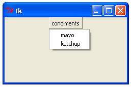
from Tkinter import *
import tkMessageBox
import Tkinter

top = Tk()

mb=  Menubutton ( top, text="condiments", relief=RAISED )
mb.grid()
mb.menu =  Menu ( mb, tearoff = 0 )
mb["menu"] =  mb.menu

mayoVar = IntVar()
ketchVar = IntVar()

mb.menu.add_checkbutton ( label="mayo",
                          variable=mayoVar )
mb.menu.add_checkbutton ( label="ketchup",
                          variable=ketchVar )

mb.pack()
top.mainloop()
When the above code is executed, it produces the following result −
The goal of this widget is to allow us to create all kinds of menus that can be used by our applications. The core functionality provides ways to create three menu types: pop-up, toplevel and pull-down.
It is also possible to use other extended widgets to implement new types of menus, such as the OptionMenu widget, which implements a special type that generates a pop-up list of items within a selection.
Here is the simple syntax to create this widget −
w = Menu ( master, option, ... )
master − This represents the parent window.
options − Here is the list of most commonly used options for this widget. These options can be used as key-value pairs separated by commas.
| Sr.No. | Description |
|---|---|
| 1 | activebackground The background color that will appear on a choice when it is under the mouse. |
| 2 | activeborderwidth Specifies the width of a border drawn around a choice when it is under the mouse. Default is 1 pixel. |
| 3 | activeforeground The foreground color that will appear on a choice when it is under the mouse. |
| 4 | bg The background color for choices not under the mouse. |
| 5 | bd The width of the border around all the choices. Default is 1. |
| 6 | cursor The cursor that appears when the mouse is over the choices, but only when the menu has been torn off. |
| 7 | disabledforeground The color of the text for items whose state is DISABLED. |
| 8 | font The default font for textual choices. |
| 9 | fg The foreground color used for choices not under the mouse. |
| 10 | postcommand You can set this option to a procedure, and that procedure will be called every time someone brings up this menu. |
| 11 | relief The default 3-D effect for menus is relief=RAISED. |
| 12 | image To display an image on this menubutton. |
| 13 | selectcolor Specifies the color displayed in checkbuttons and radiobuttons when they are selected. |
| 14 | tearoff Normally, a menu can be torn off, the first position (position 0) in the list of choices is occupied by the tear-off element, and the additional choices are added starting at position 1. If you set tearoff=0, the menu will not have a tear-off feature, and choices will be added starting at position 0. |
| 15 | title Normally, the title of a tear-off menu window will be the same as the text of the menubutton or cascade that lead to this menu. If you want to change the title of that window, set the title option to that string. |
These methods are available on Menu objects −
| Sr.No. | Option & Description |
|---|---|
| 1 | add_command (options) Adds a menu item to the menu. |
| 2 | add_radiobutton( options ) Creates a radio button menu item. |
| 3 | add_checkbutton( options ) Creates a check button menu item. |
| 4 | add_cascade(options) Creates a new hierarchical menu by associating a given menu to a parent menu |
| 5 | add_separator() Adds a separator line to the menu. |
| 6 | add( type, options ) Adds a specific type of menu item to the menu. |
| 7 | delete( startindex [, endindex ]) Deletes the menu items ranging from startindex to endindex. |
| 8 | entryconfig( index, options ) Allows you to modify a menu item, which is identified by the index, and change its options. |
| 9 | index(item) Returns the index number of the given menu item label. |
| 10 | insert_separator ( index ) Insert a new separator at the position specified by index. |
| 11 | invoke ( index ) Calls the command callback associated with the choice at position index. If a checkbutton, its state is toggled between set and cleared; if a radiobutton, that choice is set. |
| 12 | type ( index ) Returns the type of the choice specified by index: either "cascade", "checkbutton", "command", "radiobutton", "separator", or "tearoff". |
Try the following example yourself −
from Tkinter import *

def donothing():
   filewin = Toplevel(root)
   button = Button(filewin, text="Do nothing button")
   button.pack()

root = Tk()
menubar = Menu(root)
filemenu = Menu(menubar, tearoff=0)
filemenu.add_command(label="New", command=donothing)
filemenu.add_command(label="Open", command=donothing)
filemenu.add_command(label="Save", command=donothing)
filemenu.add_command(label="Save as...", command=donothing)
filemenu.add_command(label="Close", command=donothing)

filemenu.add_separator()

filemenu.add_command(label="Exit", command=root.quit)
menubar.add_cascade(label="File", menu=filemenu)
editmenu = Menu(menubar, tearoff=0)
editmenu.add_command(label="Undo", command=donothing)

editmenu.add_separator()

editmenu.add_command(label="Cut", command=donothing)
editmenu.add_command(label="Copy", command=donothing)
editmenu.add_command(label="Paste", command=donothing)
editmenu.add_command(label="Delete", command=donothing)
editmenu.add_command(label="Select All", command=donothing)

menubar.add_cascade(label="Edit", menu=editmenu)
helpmenu = Menu(menubar, tearoff=0)
helpmenu.add_command(label="Help Index", command=donothing)
helpmenu.add_command(label="About...", command=donothing)
menubar.add_cascade(label="Help", menu=helpmenu)

root.config(menu=menubar)
root.mainloop()
When the above code is executed, it produces the following result −

This widget provides a multiline and noneditable object that displays texts, automatically breaking lines and justifying their contents.
Its functionality is very similar to the one provided by the Label widget, except that it can also automatically wrap the text, maintaining a given width or aspect ratio.
Here is the simple syntax to create this widget −
w = Message ( master, option, ... )
master − This represents the parent window.
options − Here is the list of most commonly used options for this widget. These options can be used as key-value pairs separated by commas.
| Sr.No. | Option & Description |
|---|---|
| 1 | anchor This options controls where the text is positioned if the widget has more space than the text needs. The default is anchor=CENTER, which centers the text in the available space. |
| 2 | bg The normal background color displayed behind the label and indicator. |
| 3 | bitmap Set this option equal to a bitmap or image object and the label will display that graphic. |
| 4 | bd The size of the border around the indicator. Default is 2 pixels. |
| 5 | cursor If you set this option to a cursor name (arrow, dot etc.), the mouse cursor will change to that pattern when it is over the checkbutton. |
| 6 | font If you are displaying text in this label (with the text or textvariable option, the font option specifies in what font that text will be displayed. |
| 7 | fg If you are displaying text or a bitmap in this label, this option specifies the color of the text. If you are displaying a bitmap, this is the color that will appear at the position of the 1-bits in the bitmap. |
| 8 | height The vertical dimension of the new frame. |
| 9 | image To display a static image in the label widget, set this option to an image object. |
| 10 | justify Specifies how multiple lines of text will be aligned with respect to each other: LEFT for flush left, CENTER for centered (the default), or RIGHT for right-justified. |
| 11 | padx Extra space added to the left and right of the text within the widget. Default is 1. |
| 12 | pady Extra space added above and below the text within the widget. Default is 1. |
| 13 | relief Specifies the appearance of a decorative border around the label. The default is FLAT; for other values. |
| 14 | text To display one or more lines of text in a label widget, set this option to a string containing the text. Internal newlines ("\n") will force a line break. |
| 15 | textvariable To slave the text displayed in a label widget to a control variable of class StringVar, set this option to that variable. |
| 16 | underline You can display an underline (_) below the nth letter of the text, counting from 0, by setting this option to n. The default is underline=-1, which means no underlining. |
| 17 | width Width of the label in characters (not pixels!). If this option is not set, the label will be sized to fit its contents. |
| 18 | wraplength You can limit the number of characters in each line by setting this option to the desired number. The default value, 0, means that lines will be broken only at newlines. |
Try the following example yourself −
from Tkinter import *

root = Tk()
var = StringVar()
label = Message( root, textvariable=var, relief=RAISED )

var.set("Hey!? How are you doing?")
label.pack()
root.mainloop()
When the above code is executed, it produces the following result −
This widget implements a multiple-choice button, which is a way to offer many possible selections to the user and lets user choose only one of them.
In order to implement this functionality, each group of radiobuttons must be associated to the same variable and each one of the buttons must symbolize a single value. You can use the Tab key to switch from one radionbutton to another.
Here is the simple syntax to create this widget −
w = Radiobutton ( master, option, ... )
master − This represents the parent window.
options − Here is the list of most commonly used options for this widget. These options can be used as key-value pairs separated by commas.
| Sr.No. | Option & Description |
|---|---|
| 1 | activebackground The background color when the mouse is over the radiobutton. |
| 2 | activeforeground The foreground color when the mouse is over the radiobutton. |
| 3 | anchor If the widget inhabits a space larger than it needs, this option specifies where the radiobutton will sit in that space. The default is anchor=CENTER. |
| 4 | bg The normal background color behind the indicator and label. |
| 5 | bitmap To display a monochrome image on a radiobutton, set this option to a bitmap. |
| 6 | borderwidth The size of the border around the indicator part itself. Default is 2 pixels. |
| 7 | command A procedure to be called every time the user changes the state of this radiobutton. |
| 8 | cursor If you set this option to a cursor name (arrow, dot etc.), the mouse cursor will change to that pattern when it is over the radiobutton. |
| 9 | font The font used for the text. |
| 10 | fg The color used to render the text. |
| 11 | height The number of lines (not pixels) of text on the radiobutton. Default is 1. |
| 12 | highlightbackground The color of the focus highlight when the radiobutton does not have focus. |
| 13 | highlightcolor The color of the focus highlight when the radiobutton has the focus. |
| 14 | image To display a graphic image instead of text for this radiobutton, set this option to an image object. |
| 15 | justify If the text contains multiple lines, this option controls how the text is justified: CENTER (the default), LEFT, or RIGHT. |
| 16 | padx How much space to leave to the left and right of the radiobutton and text. Default is 1. |
| 17 | pady How much space to leave above and below the radiobutton and text. Default is 1. |
| 18 | relief Specifies the appearance of a decorative border around the label. The default is FLAT; for other values. |
| 19 | selectcolor The color of the radiobutton when it is set. Default is red. |
| 20 | selectimage If you are using the image option to display a graphic instead of text when the radiobutton is cleared, you can set the selectimage option to a different image that will be displayed when the radiobutton is set. |
| 21 | state The default is state=NORMAL, but you can set state=DISABLED to gray out the control and make it unresponsive. If the cursor is currently over the radiobutton, the state is ACTIVE. |
| 22 | text The label displayed next to the radiobutton. Use newlines ("\n") to display multiple lines of text. |
| 23 | textvariable To slave the text displayed in a label widget to a control variable of class StringVar, set this option to that variable. |
| 24 | underline You can display an underline (_) below the nth letter of the text, counting from 0, by setting this option to n. The default is underline=-1, which means no underlining. |
| 25 | value When a radiobutton is turned on by the user, its control variable is set to its current value option. If the control variable is an IntVar, give each radiobutton in the group a different integer value option. If the control variable is a StringVar, give each radiobutton a different string value option. |
| 26 | variable The control variable that this radiobutton shares with the other radiobuttons in the group. This can be either an IntVar or a StringVar. |
| 27 | width Width of the label in characters (not pixels!). If this option is not set, the label will be sized to fit its contents. |
| 28 | wraplength You can limit the number of characters in each line by setting this option to the desired number. The default value, 0, means that lines will be broken only at newlines. |
| Sr.No. | Method & Description |
|---|---|
| 1 | deselect() Clears (turns off) the radiobutton. |
| 2 | flash() Flashes the radiobutton a few times between its active and normal colors, but leaves it the way it started. |
| 3 | invoke() You can call this method to get the same actions that would occur if the user clicked on the radiobutton to change its state. |
| 4 | select() Sets (turns on) the radiobutton. |
Try the following example yourself −
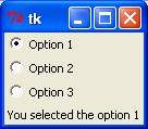
from Tkinter import *

def sel():
   selection = "You selected the option " + str(var.get())
   label.config(text = selection)

root = Tk()
var = IntVar()
R1 = Radiobutton(root, text="Option 1", variable=var, value=1,
                  command=sel)
R1.pack( anchor = W )

R2 = Radiobutton(root, text="Option 2", variable=var, value=2,
                  command=sel)
R2.pack( anchor = W )

R3 = Radiobutton(root, text="Option 3", variable=var, value=3,
                  command=sel)
R3.pack( anchor = W)

label = Label(root)
label.pack()
root.mainloop()
When the above code is executed, it produces the following result −
The Scale widget provides a graphical slider object that allows you to select values from a specific scale.
Here is the simple syntax to create this widget −
w = Scale ( master, option, ... )
master − This represents the parent window.
options − Here is the list of most commonly used options for this widget. These options can be used as key-value pairs separated by commas.
| Sr.No. | Option & Description |
|---|---|
| 1 | activebackground The background color when the mouse is over the scale. |
| 2 | bg The background color of the parts of the widget that are outside the trough. |
| 3 | bd Width of the 3-d border around the trough and slider. Default is 2 pixels. |
| 4 | command A procedure to be called every time the slider is moved. This procedure will be passed one argument, the new scale value. If the slider is moved rapidly, you may not get a callback for every possible position, but you'll certainly get a callback when it settles. |
| 5 | cursor If you set this option to a cursor name (arrow, dot etc.), the mouse cursor will change to that pattern when it is over the scale. |
| 6 | digits The way your program reads the current value shown in a scale widget is through a control variable. The control variable for a scale can be an IntVar, a DoubleVar (float), or a StringVar. If it is a string variable, the digits option controls how many digits to use when the numeric scale value is converted to a string. |
| 7 | font The font used for the label and annotations. |
| 8 | fg The color of the text used for the label and annotations. |
| 9 | from_ A float or integer value that defines one end of the scale's range. |
| 10 | highlightbackground The color of the focus highlight when the scale does not have focus. |
| 11 | highlightcolor The color of the focus highlight when the scale has the focus. |
| 12 | label You can display a label within the scale widget by setting this option to the label's text. The label appears in the top left corner if the scale is horizontal, or the top right corner if vertical. The default is no label. |
| 13 | length The length of the scale widget. This is the x dimension if the scale is horizontal, or the y dimension if vertical. The default is 100 pixels. |
| 14 | orient Set orient=HORIZONTAL if you want the scale to run along the x dimension, or orient=VERTICAL to run parallel to the y-axis. Default is horizontal. |
| 15 | relief Specifies the appearance of a decorative border around the label. The default is FLAT; for other values. |
| 16 | repeatdelay This option controls how long button 1 has to be held down in the trough before the slider starts moving in that direction repeatedly. Default is repeatdelay=300, and the units are milliseconds. |
| 17 | resolution Normally, the user will only be able to change the scale in whole units. Set this option to some other value to change the smallest increment of the scale's value. For example, if from_=-1.0 and to=1.0, and you set resolution=0.5, the scale will have 5 possible values: -1.0, -0.5, 0.0, +0.5, and +1.0. |
| 18 | showvalue Normally, the current value of the scale is displayed in text form by the slider (above it for horizontal scales, to the left for vertical scales). Set this option to 0 to suppress that label. |
| 19 | sliderlength Normally the slider is 30 pixels along the length of the scale. You can change that length by setting the sliderlength option to your desired length. |
| 20 | state Normally, scale widgets respond to mouse events, and when they have the focus, also keyboard events. Set state=DISABLED to make the widget unresponsive. |
| 21 | takefocus Normally, the focus will cycle through scale widgets. Set this option to 0 if you don't want this behavior. |
| 22 | tickinterval To display periodic scale values, set this option to a number, and ticks will be displayed on multiples of that value. For example, if from_=0.0, to=1.0, and tickinterval=0.25, labels will be displayed along the scale at values 0.0, 0.25, 0.50, 0.75, and 1.00. These labels appear below the scale if horizontal, to its left if vertical. Default is 0, which suppresses display of ticks. |
| 23 | to A float or integer value that defines one end of the scale's range; the other end is defined by the from_ option, discussed above. The to value can be either greater than or less than the from_ value. For vertical scales, the to value defines the bottom of the scale; for horizontal scales, the right end. |
| 24 | troughcolor The color of the trough. |
| 25 | variable The control variable for this scale, if any. Control variables may be from class IntVar, DoubleVar (float), or StringVar. In the latter case, the numerical value will be converted to a string. |
| 26 | width The width of the trough part of the widget. This is the x dimension for vertical scales and the y dimension if the scale has orient=HORIZONTAL. Default is 15 pixels. |
Scale objects have these methods −
| Sr.No. | Method & Description |
|---|---|
| 1 | get() This method returns the current value of the scale. |
| 2 | set ( value ) Sets the scale's value. |
Try the following example yourself −
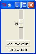
from Tkinter import *

def sel():
   selection = "Value = " + str(var.get())
   label.config(text = selection)

root = Tk()
var = DoubleVar()
scale = Scale( root, variable = var )
scale.pack(anchor=CENTER)

button = Button(root, text="Get Scale Value", command=sel)
button.pack(anchor=CENTER)

label = Label(root)
label.pack()

root.mainloop()
When the above code is executed, it produces the following result −
This widget provides a slide controller that is used to implement vertical scrolled widgets, such as Listbox, Text and Canvas. Note that you can also create horizontal scrollbars on Entry widgets.
Here is the simple syntax to create this widget −
w = Scrollbar ( master, option, ... )
master − This represents the parent window.
options − Here is the list of most commonly used options for this widget. These options can be used as key-value pairs separated by commas.
| Sr.No. | Option & Description |
|---|---|
| 1 | activebackground The color of the slider and arrowheads when the mouse is over them. |
| 2 | bg The color of the slider and arrowheads when the mouse is not over them. |
| 3 | bd The width of the 3-d borders around the entire perimeter of the trough, and also the width of the 3-d effects on the arrowheads and slider. Default is no border around the trough, and a 2-pixel border around the arrowheads and slider. |
| 4 | command A procedure to be called whenever the scrollbar is moved. |
| 5 | cursor The cursor that appears when the mouse is over the scrollbar. |
| 6 | elementborderwidth The width of the borders around the arrowheads and slider. The default is elementborderwidth=-1, which means to use the value of the borderwidth option. |
| 7 | highlightbackground The color of the focus highlight when the scrollbar does not have focus. |
| 8 | highlightcolor The color of the focus highlight when the scrollbar has the focus. |
| 9 | highlightthickness The thickness of the focus highlight. Default is 1. Set to 0 to suppress display of the focus highlight. |
| 10 | jump This option controls what happens when a user drags the slider. Normally (jump=0), every small drag of the slider causes the command callback to be called. If you set this option to 1, the callback isn't called until the user releases the mouse button. |
| 11 | orient Set orient=HORIZONTAL for a horizontal scrollbar, orient=VERTICAL for a vertical one. |
| 12 | repeatdelay This option controls how long button 1 has to be held down in the trough before the slider starts moving in that direction repeatedly. Default is repeatdelay=300, and the units are milliseconds. |
| 13 | repeatinterval repeatinterval |
| 14 | takefocus Normally, you can tab the focus through a scrollbar widget. Set takefocus=0 if you don't want this behavior. |
| 15 | troughcolor The color of the trough. |
| 16 | width Width of the scrollbar (its y dimension if horizontal, and its x dimension if vertical). Default is 16. |
Scrollbar objects have these methods −
| Sr.No. | Method & Description |
|---|---|
| 1 | get() Returns two numbers (a, b) describing the current position of the slider. The a value gives the position of the left or top edge of the slider, for horizontal and vertical scrollbars respectively; the b value gives the position of the right or bottom edge. |
| 2 | set ( first, last ) To connect a scrollbar to another widget w, set w's xscrollcommand or yscrollcommand to the scrollbar's set() method. The arguments have the same meaning as the values returned by the get() method. |
Try the following example yourself −
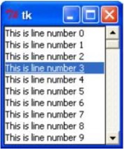
from Tkinter import *

root = Tk()
scrollbar = Scrollbar(root)
scrollbar.pack( side = RIGHT, fill = Y )

mylist = Listbox(root, yscrollcommand = scrollbar.set )
for line in range(100):
   mylist.insert(END, "This is line number " + str(line))

mylist.pack( side = LEFT, fill = BOTH )
scrollbar.config( command = mylist.yview )

mainloop()
When the above code is executed, it produces the following result −
Text widgets provide advanced capabilities that allow you to edit a multiline text and format the way it has to be displayed, such as changing its color and font.
You can also use elegant structures like tabs and marks to locate specific sections of the text, and apply changes to those areas. Moreover, you can embed windows and images in the text because this widget was designed to handle both plain and formatted text.
Here is the simple syntax to create this widget −
w = Text ( master, option, ... )
master − This represents the parent window.
options − Here is the list of most commonly used options for this widget. These options can be used as key-value pairs separated by commas.
| Sr.No. | Option & Description |
|---|---|
| 1 | bg The default background color of the text widget. |
| 2 | bd The width of the border around the text widget. Default is 2 pixels. |
| 3 | cursor The cursor that will appear when the mouse is over the text widget. |
| 4 | exportselection Normally, text selected within a text widget is exported to be the selection in the window manager. Set exportselection=0 if you don't want that behavior. |
| 5 | font The default font for text inserted into the widget. |
| 6 | fg The color used for text (and bitmaps) within the widget. You can change the color for tagged regions; this option is just the default. |
| 7 | height The height of the widget in lines (not pixels!), measured according to the current font size. |
| 8 | highlightbackground The color of the focus highlight when the text widget does not have focus. |
| 9 | highlightcolor The color of the focus highlight when the text widget has the focus. |
| 10 | highlightthickness The thickness of the focus highlight. Default is 1. Set highlightthickness=0 to suppress display of the focus highlight. |
| 11 | insertbackground The color of the insertion cursor. Default is black. |
| 12 | insertborderwidth Size of the 3-D border around the insertion cursor. Default is 0. |
| 13 | insertofftime The number of milliseconds the insertion cursor is off during its blink cycle. Set this option to zero to suppress blinking. Default is 300. |
| 14 | insertontime The number of milliseconds the insertion cursor is on during its blink cycle. Default is 600. |
| 15 | insertwidth Width of the insertion cursor (its height is determined by the tallest item in its line). Default is 2 pixels. |
| 16 | padx The size of the internal padding added to the left and right of the text area. Default is one pixel. |
| 17 | pady The size of the internal padding added above and below the text area. Default is one pixel. |
| 18 | relief The 3-D appearance of the text widget. Default is relief=SUNKEN. |
| 19 | selectbackground The background color to use displaying selected text. |
| 20 | selectborderwidth The width of the border to use around selected text. |
| 21 | spacing1 This option specifies how much extra vertical space is put above each line of text. If a line wraps, this space is added only before the first line it occupies on the display. Default is 0. |
| 22 | spacing2 This option specifies how much extra vertical space to add between displayed lines of text when a logical line wraps. Default is 0. |
| 23 | spacing3 This option specifies how much extra vertical space is added below each line of text. If a line wraps, this space is added only after the last line it occupies on the display. Default is 0. |
| 24 | state Normally, text widgets respond to keyboard and mouse events; set state=NORMAL to get this behavior. If you set state=DISABLED, the text widget will not respond, and you won't be able to modify its contents programmatically either. |
| 25 | tabs This option controls how tab characters position text. |
| 26 | width The width of the widget in characters (not pixels!), measured according to the current font size. |
| 27 | wrap This option controls the display of lines that are too wide. Set wrap=WORD and it will break the line after the last word that will fit. With the default behavior, wrap=CHAR, any line that gets too long will be broken at any character. |
| 28 | xscrollcommand To make the text widget horizontally scrollable, set this option to the set() method of the horizontal scrollbar. |
| 29 | yscrollcommand To make the text widget vertically scrollable, set this option to the set() method of the vertical scrollbar. |
Text objects have these methods −
| Sr.No. | Methods & Description |
|---|---|
| 1 | delete(startindex [,endindex]) This method deletes a specific character or a range of text. |
| 2 | get(startindex [,endindex]) This method returns a specific character or a range of text. |
| 3 | index(index) Returns the absolute value of an index based on the given index. |
| 4 | insert(index [,string]...) This method inserts strings at the specified index location. |
| 5 | see(index) This method returns true if the text located at the index position is visible. |
Text widgets support three distinct helper structures: Marks, Tabs, and Indexes −
Marks are used to bookmark positions between two characters within a given text. We have the following methods available when handling marks −
| Sr.No. | Methods & Description |
|---|---|
| 1 | index(mark) Returns the line and column location of a specific mark. |
| 2 | mark_gravity(mark [,gravity]) Returns the gravity of the given mark. If the second argument is provided, the gravity is set for the given mark. |
| 3 | mark_names() Returns all marks from the Text widget. |
| 4 | mark_set(mark, index) Informs a new position to the given mark. |
| 5 | mark_unset(mark) Removes the given mark from the Text widget. |
Tags are used to associate names to regions of text which makes easy the task of modifying the display settings of specific text areas. Tags are also used to bind event callbacks to specific ranges of text.
Following are the available methods for handling tabs −
| Sr.No. | Methods & Description |
|---|---|
| 1 | tag_add(tagname, startindex[,endindex] ...) This method tags either the position defined by startindex, or a range delimited by the positions startindex and endindex. |
| 2 | tag_config You can use this method to configure the tag properties, which include, justify(center, left, or right), tabs(this property has the same functionality of the Text widget tabs's property), and underline(used to underline the tagged text). |
| 3 | tag_delete(tagname) This method is used to delete and remove a given tag. |
| 4 | tag_remove(tagname [,startindex[.endindex]] ...) After applying this method, the given tag is removed from the provided area without deleting the actual tag definition. |
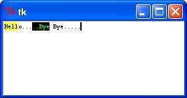
Try the following example yourself −
from Tkinter import *

def onclick():
   pass

root = Tk()
text = Text(root)
text.insert(INSERT, "Hello.....")
text.insert(END, "Bye Bye.....")
text.pack()

text.tag_add("here", "1.0", "1.4")
text.tag_add("start", "1.8", "1.13")
text.tag_config("here", background="yellow", foreground="blue")
text.tag_config("start", background="black", foreground="green")
root.mainloop()
When the above code is executed, it produces the following result −
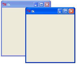
Toplevel widgets work as windows that are directly managed by the window manager. They do not necessarily have a parent widget on top of them.
Your application can use any number of top-level windows.
Here is the simple syntax to create this widget −
w = Toplevel ( option, ... )
options − Here is the list of most commonly used options for this widget. These options can be used as key-value pairs separated by commas.
| Sr.No. | Option & Description |
|---|---|
| 1 | bg The background color of the window. |
| 2 | bd Border width in pixels; default is 0. |
| 3 | cursor The cursor that appears when the mouse is in this window. |
| 4 | class_ Normally, text selected within a text widget is exported to be the selection in the window manager. Set exportselection=0 if you don't want that behavior. |
| 5 | font The default font for text inserted into the widget. |
| 6 | fg The color used for text (and bitmaps) within the widget. You can change the color for tagged regions; this option is just the default. |
| 7 | height Window height. |
| 8 | relief Normally, a top-level window will have no 3-d borders around it. To get a shaded border, set the bd option larger that its default value of zero, and set the relief option to one of the constants. |
| 9 | width The desired width of the window. |
Toplevel objects have these methods −
| Sr.No. | Methods & Description |
|---|---|
| 1 | deiconify() Displays the window, after using either the iconify or the withdraw methods. |
| 2 | frame() Returns a system-specific window identifier. |
| 3 | group(window) Adds the window to the window group administered by the given window. |
| 4 | iconify() Turns the window into an icon, without destroying it. |
| 5 | protocol(name, function) Registers a function as a callback which will be called for the given protocol. |
| 6 | iconify() Turns the window into an icon, without destroying it. |
| 7 | state() Returns the current state of the window. Possible values are normal, iconic, withdrawn and icon. |
| 8 | transient([master]) Turns the window into a temporary(transient) window for the given master or to the window's parent, when no argument is given. |
| 9 | withdraw() Removes the window from the screen, without destroying it. |
| 10 | maxsize(width, height) Defines the maximum size for this window. |
| 11 | minsize(width, height) Defines the minimum size for this window. |
| 12 | positionfrom(who) Defines the position controller. |
| 13 | resizable(width, height) Defines the resize flags, which control whether the window can be resized. |
| 14 | sizefrom(who) Defines the size controller. |
| 15 | title(string) Defines the window title. |
Try following example yourself −
from Tkinter import *

root = Tk()
top = Toplevel()
top.mainloop()
When the above code is executed, it produces the following result −
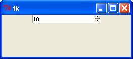
The Spinbox widget is a variant of the standard Tkinter Entry widget, which can be used to select from a fixed number of values.
Here is the simple syntax to create this widget −
w = Spinbox( master, option, ... )
master − This represents the parent window.
options − Here is the list of most commonly used options for this widget. These options can be used as key-value pairs separated by commas.
| Sr.No. | Option & Description |
|---|---|
| 1 | activebackground The color of the slider and arrowheads when the mouse is over them. |
| 2 | bg The color of the slider and arrowheads when the mouse is not over them. |
| 3 | bd The width of the 3-d borders around the entire perimeter of the trough, and also the width of the 3-d effects on the arrowheads and slider. Default is no border around the trough, and a 2-pixel border around the arrowheads and slider. |
| 4 | command A procedure to be called whenever the scrollbar is moved. |
| 5 | cursor The cursor that appears when the mouse is over the scrollbar. |
| 6 | disabledbackground The background color to use when the widget is disabled. |
| 7 | disabledforeground The text color to use when the widget is disabled. |
| 8 | fg Text color. |
| 9 | font The font to use in this widget. |
| 10 | format Format string. No default value. |
| 11 | from_ The minimum value. Used together with to to limit the spinbox range. |
| 12 | justify Default is LEFT |
| 13 | relief Default is SUNKEN. |
| 14 | repeatdelay Together with repeatinterval, this option controls button auto-repeat. Both values are given in milliseconds. |
| 15 | repeatinterval See repeatdelay. |
| 16 | state One of NORMAL, DISABLED, or "readonly". Default is NORMAL. |
| 17 | textvariable No default value. |
| 18 | to See from. |
| 19 | validate Validation mode. Default is NONE. |
| 20 | validatecommand Validation callback. No default value. |
| 21 | values A tuple containing valid values for this widget. Overrides from/to/increment. |
| 22 | vcmd Same as validatecommand. |
| 23 | width Widget width, in character units. Default is 20. |
| 24 | wrap If true, the up and down buttons will wrap around. |
| 25 | xscrollcommand Used to connect a spinbox field to a horizontal scrollbar. This option should be set to the set method of the corresponding scrollbar. |
Spinbox objects have these methods −
| Sr.No. | Methods & Description |
|---|---|
| 1 | delete(startindex [,endindex]) This method deletes a specific character or a range of text. |
| 2 | get(startindex [,endindex]) This method returns a specific character or a range of text. |
| 3 | identify(x, y) Identifies the widget element at the given location. |
| 4 | index(index) Returns the absolute value of an index based on the given index. |
| 5 | insert(index [,string]...) This method inserts strings at the specified index location. |
| 6 | invoke(element) Invokes a spinbox button. |
Try the following example yourself −
from Tkinter import *

master = Tk()

w = Spinbox(master, from_=0, to=10)
w.pack()

mainloop()
When the above code is executed, it produces the following result −
A PanedWindow is a container widget that may contain any number of panes, arranged horizontally or vertically.
Each pane contains one widget and each pair of panes is separated by a movable (via mouse movements) sash. Moving a sash causes the widgets on either side of the sash to be resized.
Here is the simple syntax to create this widget −
w = PanedWindow( master, option, ... )
master − This represents the parent window.
options − Here is the list of most commonly used options for this widget. These options can be used as key-value pairs separated by commas.
| Sr.No. | Option & Description |
|---|---|
| 1 | bg The color of the slider and arrowheads when the mouse is not over them. |
| 2 | bd The width of the 3-d borders around the entire perimeter of the trough, and also the width of the 3-d effects on the arrowheads and slider. Default is no border around the trough, and a 2-pixel border around the arrowheads and slider. |
| 3 | borderwidth Default is 2. |
| 4 | cursor The cursor that appears when the mouse is over the window. |
| 5 | handlepad Default is 8. |
| 6 | handlesize Default is 8. |
| 7 | height No default value. |
| 8 | orient Default is HORIZONTAL. |
| 9 | relief Default is FLAT. |
| 10 | sashcursor No default value. |
| 11 | sashrelief Default is RAISED. |
| 12 | sashwidth Default is 2. |
| 13 | showhandle No default value. |
| 14 | width No default value. |
PanedWindow objects have these methods −
| Sr.No. | Methods & Description |
|---|---|
| 1 | add(child, options) Adds a child window to the paned window. |
| 2 | get(startindex [,endindex]) This method returns a specific character or a range of text. |
| 3 | config(options) Modifies one or more widget options. If no options are given, the method returns a dictionary containing all current option values. |
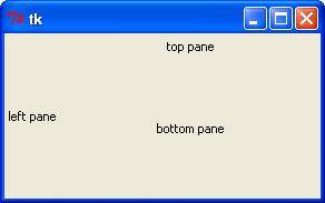
Try the following example yourself. Here's how to create a 3-pane widget −
from Tkinter import *

m1 = PanedWindow()
m1.pack(fill=BOTH, expand=1)

left = Label(m1, text="left pane")
m1.add(left)

m2 = PanedWindow(m1, orient=VERTICAL)
m1.add(m2)

top = Label(m2, text="top pane")
m2.add(top)

bottom = Label(m2, text="bottom pane")
m2.add(bottom)

mainloop()
When the above code is executed, it produces the following result −
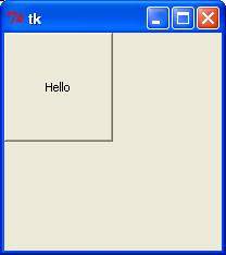
A labelframe is a simple container widget. Its primary purpose is to act as a spacer or container for complex window layouts.
This widget has the features of a frame plus the ability to display a label.
Here is the simple syntax to create this widget −
w = LabelFrame( master, option, ... )
master − This represents the parent window.
options − Here is the list of most commonly used options for this widget. These options can be used as key-value pairs separated by commas.
| Sr.No. | Option & Description |
|---|---|
| 1 | bg The normal background color displayed behind the label and indicator. |
| 2 | bd The size of the border around the indicator. Default is 2 pixels. |
| 3 | cursor If you set this option to a cursor name (arrow, dot etc.), the mouse cursor will change to that pattern when it is over the checkbutton. |
| 4 | font The vertical dimension of the new frame. |
| 5 | height The vertical dimension of the new frame. |
| 6 | labelAnchor Specifies where to place the label. |
| 7 | highlightbackground Color of the focus highlight when the frame does not have focus. |
| 8 | highlightcolor Color shown in the focus highlight when the frame has the focus. |
| 9 | highlightthickness Thickness of the focus highlight. |
| 10 | relief With the default value, relief=FLAT, the checkbutton does not stand out from its background. You may set this option to any of the other styles |
| 11 | text Specifies a string to be displayed inside the widget. |
| 12 | width Specifies the desired width for the window. |
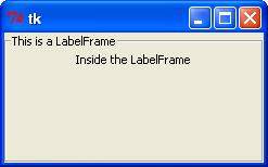
Try the following example yourself. Here is how to create a labelframe widget −
from Tkinter import *

root = Tk()

labelframe = LabelFrame(root, text="This is a LabelFrame")
labelframe.pack(fill="both", expand="yes")

left = Label(labelframe, text="Inside the LabelFrame")
left.pack()

root.mainloop()
When the above code is executed, it produces the following result −
The tkMessageBox module is used to display message boxes in your applications. This module provides a number of functions that you can use to display an appropriate message.
Some of these functions are showinfo, showwarning, showerror, askquestion, askokcancel, askyesno, and askretryignore.
Here is the simple syntax to create this widget −
tkMessageBox.FunctionName(title, message [, options])
FunctionName − This is the name of the appropriate message box function.
title − This is the text to be displayed in the title bar of a message box.
message − This is the text to be displayed as a message.
options − options are alternative choices that you may use to tailor a standard message box. Some of the options that you can use are default and parent. The default option is used to specify the default button, such as ABORT, RETRY, or IGNORE in the message box. The parent option is used to specify the window on top of which the message box is to be displayed.
You could use one of the following functions with dialogue box −
Try the following example yourself −
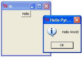
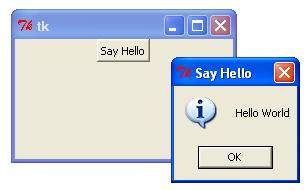
import Tkinter
import tkMessageBox

top = Tkinter.Tk()
def hello():
   tkMessageBox.showinfo("Say Hello", "Hello World")

B1 = Tkinter.Button(top, text = "Say Hello", command = hello)
B1.pack()

top.mainloop()
When the above code is executed, it produces the following result −
Various lengths, widths, and other dimensions of widgets can be described in many different units.
If you set a dimension to an integer, it is assumed to be in pixels.
You can specify units by setting a dimension to a string containing a number followed by.
| Sr.No. | Character & Description |
|---|---|
| 1 | c Centimeters |
| 2 | i Inches |
| 3 | m Millimeters |
| 4 | p Printer's points (about 1/72") |
Tkinter expresses a length as an integer number of pixels. Here is the list of common length options −
borderwidth − Width of the border which gives a three-dimensional look to the widget.
highlightthickness − Width of the highlight rectangle when the widget has focus.
padX padY − Extra space the widget requests from its layout manager beyond the minimum the widget needs to display its contents in the x and y directions.
selectborderwidth − Width of the three-dimentional border around selected items of the widget.
wraplength − Maximum line length for widgets that perform word wrapping.
height − Desired height of the widget; must be greater than or equal to 1.
underline − Index of the character to underline in the widget's text (0 is the first character, 1 the second one, and so on).
width − Desired width of the widget.
Tkinter represents colors with strings. There are two general ways to specify colors in Tkinter −
You can use a string specifying the proportion of red, green and blue in hexadecimal digits. For example, "#fff" is white, "#000000" is black, "#000fff000" is pure green, and "#00ffff" is pure cyan (green plus blue).
You can also use any locally defined standard color name. The colors "white", "black", "red", "green", "blue", "cyan", "yellow", and "magenta" will always be available.
The common color options are −
activebackground − Background color for the widget when the widget is active.
activeforeground − Foreground color for the widget when the widget is active.
background − Background color for the widget. This can also be represented as bg.
disabledforeground − Foreground color for the widget when the widget is disabled.
foreground − Foreground color for the widget. This can also be represented as fg.
highlightbackground − Background color of the highlight region when the widget has focus.
highlightcolor − Foreground color of the highlight region when the widget has focus.
selectbackground − Background color for the selected items of the widget.
selectforeground − Foreground color for the selected items of the widget.
There may be up to three ways to specify type style.
As a tuple whose first element is the font family, followed by a size in points, optionally followed by a string containing one or more of the style modifiers bold, italic, underline and overstrike.
You can create a "font object" by importing the tkFont module and using its Font class constructor −
import tkFont

font = tkFont.Font ( option, ... )
Here is the list of options −
family − The font family name as a string.
size − The font height as an integer in points. To get a font n pixels high, use -n.
weight − "bold" for boldface, "normal" for regular weight.
slant − "italic" for italic, "roman" for unslanted.
underline − 1 for underlined text, 0 for normal.
overstrike − 1 for overstruck text, 0 for normal.
helv36 = tkFont.Font(family="Helvetica",size=36,weight="bold")
If you are running under the X Window System, you can use any of the X font names.
For example, the font named "-*-lucidatypewriter-medium-r-*-*-*-140-*-*-*-*-*-*" is the author's favorite fixed-width font for onscreen use. Use the xfontsel program to help you select pleasing fonts.
Anchors are used to define where text is positioned relative to a reference point.
Here is list of possible constants, which can be used for Anchor attribute.
For example, if you use CENTER as a text anchor, the text will be centered horizontally and vertically around the reference point.
Anchor NW will position the text so that the reference point coincides with the northwest (top left) corner of the box containing the text.
Anchor W will center the text vertically around the reference point, with the left edge of the text box passing through that point, and so on.
If you create a small widget inside a large frame and use the anchor=SE option, the widget will be placed in the bottom right corner of the frame. If you used anchor=N instead, the widget would be centered along the top edge.
The anchor constants are shown in this diagram −
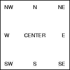
The relief style of a widget refers to certain simulated 3-D effects around the outside of the widget. Here is a screenshot of a row of buttons exhibiting all the possible relief styles −
Here is list of possible constants which can be used for relief attribute.
from Tkinter import *
import Tkinter

top = Tkinter.Tk()

B1 = Tkinter.Button(top, text ="FLAT", relief=FLAT )
B2 = Tkinter.Button(top, text ="RAISED", relief=RAISED )
B3 = Tkinter.Button(top, text ="SUNKEN", relief=SUNKEN )
B4 = Tkinter.Button(top, text ="GROOVE", relief=GROOVE )
B5 = Tkinter.Button(top, text ="RIDGE", relief=RIDGE )

B1.pack()
B2.pack()
B3.pack()
B4.pack()
B5.pack()
top.mainloop()
When the above code is executed, it produces the following result −
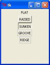
This attribute to displays a bitmap. There are following type of bitmaps available −
from Tkinter import *
import Tkinter

top = Tkinter.Tk()

B1 = Tkinter.Button(top, text ="error", relief=RAISED,\
                         bitmap="error")
B2 = Tkinter.Button(top, text ="hourglass", relief=RAISED,\
                         bitmap="hourglass")
B3 = Tkinter.Button(top, text ="info", relief=RAISED,\
                         bitmap="info")
B4 = Tkinter.Button(top, text ="question", relief=RAISED,\
                         bitmap="question")
B5 = Tkinter.Button(top, text ="warning", relief=RAISED,\
                         bitmap="warning")
B1.pack()
B2.pack()
B3.pack()
B4.pack()
B5.pack()
top.mainloop()
When the above code is executed, it produces the following result −
Python Tkinter supports quite a number of different mouse cursors available. The exact graphic may vary according to your operating system.
Here is the list of interesting ones −
Try the following example by moving cursor on different buttons −
from Tkinter import *
import Tkinter

top = Tkinter.Tk()

B1 = Tkinter.Button(top, text ="circle", relief=RAISED,\
                         cursor="circle")
B2 = Tkinter.Button(top, text ="plus", relief=RAISED,\
                         cursor="plus")
B1.pack()
B2.pack()
top.mainloop()
This geometry manager organizes widgets in blocks before placing them in the parent widget.
widget.pack( pack_options )
Here is the list of possible options −
expand − When set to true, widget expands to fill any space not otherwise used in widget's parent.
fill − Determines whether widget fills any extra space allocated to it by the packer, or keeps its own minimal dimensions: NONE (default), X (fill only horizontally), Y (fill only vertically), or BOTH (fill both horizontally and vertically).
side − Determines which side of the parent widget packs against: TOP (default), BOTTOM, LEFT, or RIGHT.
Try the following example by moving cursor on different buttons −
from Tkinter import *

root = Tk()
frame = Frame(root)
frame.pack()

bottomframe = Frame(root)
bottomframe.pack( side = BOTTOM )

redbutton = Button(frame, text="Red", fg="red")
redbutton.pack( side = LEFT)

greenbutton = Button(frame, text="green", fg="green")
greenbutton.pack( side = LEFT )

bluebutton = Button(frame, text="Blue", fg="blue")
bluebutton.pack( side = LEFT )

blackbutton = Button(bottomframe, text="Black", fg="black")
blackbutton.pack( side = BOTTOM)

root.mainloop()
When the above code is executed, it produces the following result −
This geometry manager organizes widgets in a table-like structure in the parent widget.
widget.grid( grid_options )
Here is the list of possible options −
column − The column to put widget in; default 0 (leftmost column).
columnspan − How many columns widgetoccupies; default 1.
ipadx, ipady − How many pixels to pad widget, horizontally and vertically, inside widget's borders.
padx, pady − How many pixels to pad widget, horizontally and vertically, outside v's borders.
row − The row to put widget in; default the first row that is still empty.
rowspan − How many rowswidget occupies; default 1.
sticky − What to do if the cell is larger than widget. By default, with sticky='', widget is centered in its cell. sticky may be the string concatenation of zero or more of N, E, S, W, NE, NW, SE, and SW, compass directions indicating the sides and corners of the cell to which widget sticks.
Try the following example by moving cursor on different buttons −
import Tkinter
root = Tkinter.Tk(  )
for r in range(3):
   for c in range(4):
      Tkinter.Label(root, text='R%s/C%s'%(r,c),
         borderwidth=1 ).grid(row=r,column=c)
root.mainloop(  )
This would produce the following result displaying 12 labels arrayed in a 3 × 4 grid −
This geometry manager organizes widgets by placing them in a specific position in the parent widget.
widget.place( place_options )
Here is the list of possible options −
anchor − The exact spot of widget other options refer to: may be N, E, S, W, NE, NW, SE, or SW, compass directions indicating the corners and sides of widget; default is NW (the upper left corner of widget)
bordermode − INSIDE (the default) to indicate that other options refer to the parent's inside (ignoring the parent's border); OUTSIDE otherwise.
height, width − Height and width in pixels.
relheight, relwidth − Height and width as a float between 0.0 and 1.0, as a fraction of the height and width of the parent widget.
relx, rely − Horizontal and vertical offset as a float between 0.0 and 1.0, as a fraction of the height and width of the parent widget.
x, y − Horizontal and vertical offset in pixels.
Try the following example by moving cursor on different buttons −
from Tkinter import *
import tkMessageBox
import Tkinter

top = Tkinter.Tk()

def helloCallBack():
   tkMessageBox.showinfo( "Hello Python", "Hello World")

B = Tkinter.Button(top, text ="Hello", command = helloCallBack)

B.pack()
B.place(bordermode=OUTSIDE, height=100, width=100)
top.mainloop()
When the above code is executed, it produces the following result −